Brand kit
Logos, colours and type for presenting Revomo consistently. Use them when you write about us, list us as a partner or put us on a slide.
Logo
The mark and the wordmark together are the Revomo logo. Use the full lockup by default and the mark alone only where the name is already on the page. Four variants cover every ground: two in colour, two in one colour.












- Clear space
- Keep empty space around the logo at least the height of the mark's circle on every side. Nothing else enters it: no text, no edges, no other marks.
- Minimum size
- The mark is never smaller than 20px on screen, which puts the full lockup at about 92px wide.
- Files
- SVG for anything that scales. The PNGs are transparent and named by their width in pixels.
Logomark
A bold star with a trailing effect over a circular form. The idea is unchanged from the first brand book: intelligence in motion, with a planetary reference to reach and scale. On its own, the mark stands in for the name, so use it where the name is already present or the space is square.












Colour
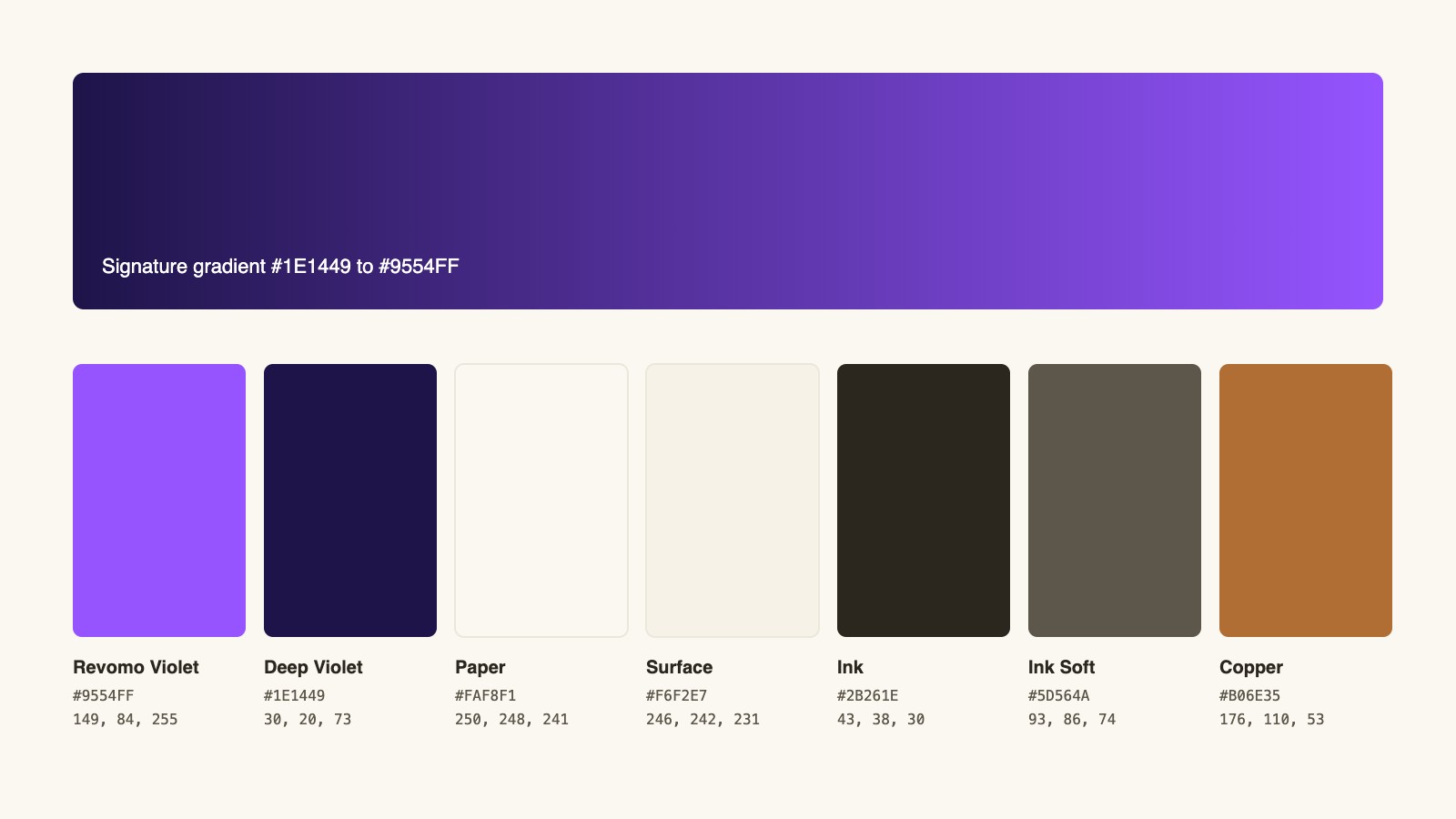
Violet ink on cotton paper. Revomo Violet is the only accent, the page is warm Paper rather than white, and text is set in a sepia Ink rather than screen black. Select a value to copy it.
Brand
- HEX
- RGB
The one brand accent. Headline accents, links, active states, the bright end of the gradient.
- HEX
- RGB
The deep end of the gradient. Closing bands, the mark, ink on light tints.
Paper and ink
- HEX
- RGB
The page. Warm cotton, never pure white.
- HEX
- RGB
Alternate sections and quiet panels.
- HEX
- RGB
Body text and the wordmark on light grounds. Sepia charcoal, never screen black.
- HEX
- RGB
Secondary text and captions.
Ink effect
- HEX
- RGB
Only inside the copper-to-violet ink shift on engraved numerals. Never a standalone accent.
Retired. The 2025 kit's tertiary blue (#1976D2), amber (#FFC107) and #121212 black are no longer part of the palette. Replace them when you update older material.
Typography
Fraunces for the voice, Inter for the work, JetBrains Mono for the serials. All three are open source under the SIL Open Font License; download them from their makers so you always have the current version.
Margin, engineered.
Every price traced to the rule that set it.
NO. RV 00023841 A
Changed in 2026. Inter Display, the 2025 headline face, is retired. Fraunces now sets headlines; Inter stays for text.
Visual direction
Five words from the first brand book still describe the brand. The 2026 system, engineered like currency, is how it keeps them.
- 01ModernClean, minimalist and contemporary.Software restraint. Flat surfaces, one accent, and no ornament that does not carry meaning.
- 02SleekProfessional yet cutting-edge.Engineered detail: hairline rules, plate serials and engraved numerals that reward a closer look.
- 03BoldA strong, confident presence.Fraunces on the display lines and the violet gradient saved for the moments that matter.
- 04MinimalNo clutter or unnecessary elements.Motifs register second. Remove them and the page still works; leave them and it is unmistakably Revomo.
- 05ScalableWorks at different sizes and formats.The mark holds at 20px, and every logo ships as SVG so it scales without loss.
Need something that isn't here?
Ask for a format, a co-branded lockup or permission for an unusual use, and we'll get back to you.