
Brand Guidelines
Use these guidelines to ensure accurate and cohesive application of
Revomo’s visual identity across all communications.
Visual Direction
Clean, minimalist, and contemporary
Professional yet cutting-edge
Strong, confident presence in the market
No clutter or unnecessary elements
Works well in different sizes and formats
Revomo Logo
Logomark
A bold star with a trailing effect placed over a circular form, evoking the idea of AI intelligence dominating the digital landscape. The planetary reference subtly hints at global influence and scalability.

Framework
The Revomo logomark has been crafted with attention to detail and can appear as a standalone logomark or as a complete lockup — with the logomark and logotype together.

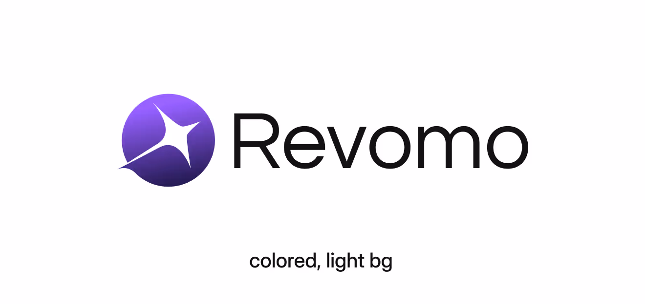
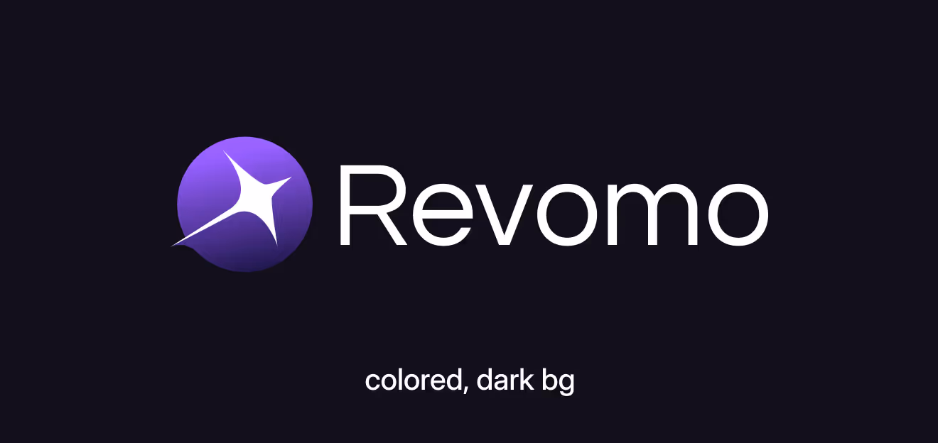
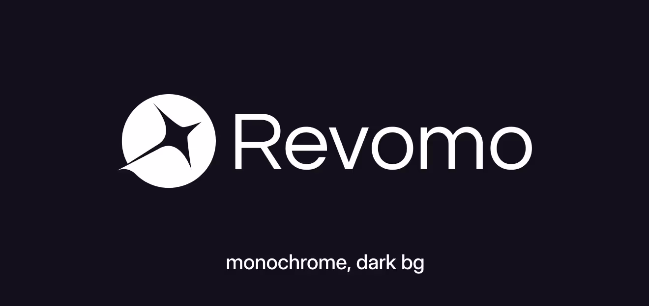
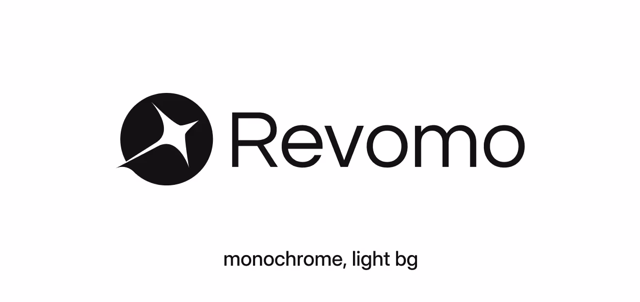
Color Specs
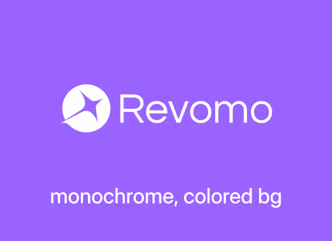
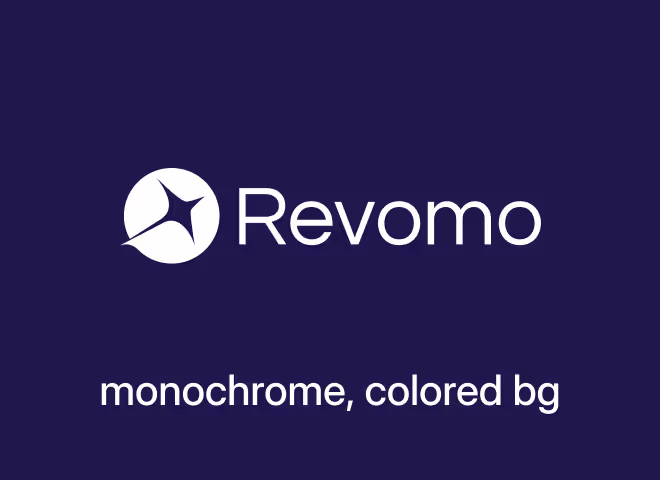
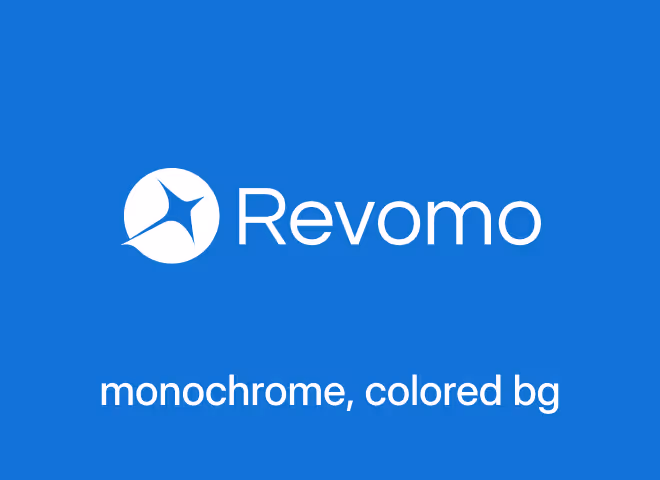
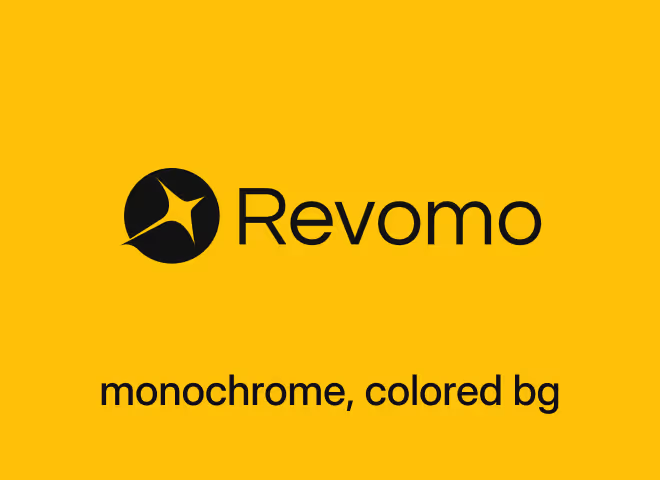
Revomo's logo includes four color variants: two colored (light and dark backgrounds) and two monochrome (light and dark backgrounds). Use the colored versions on corresponding light and dark backgrounds for optimal contrast. The monochrome variants can also be used on colored backgrounds, but ensure sufficient contrast to maintain clarity and visual impact. Refer to the examples below for guidance.
Note: Use the monochrome variants only when multicolor printing is not feasible.
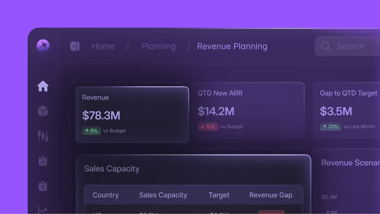
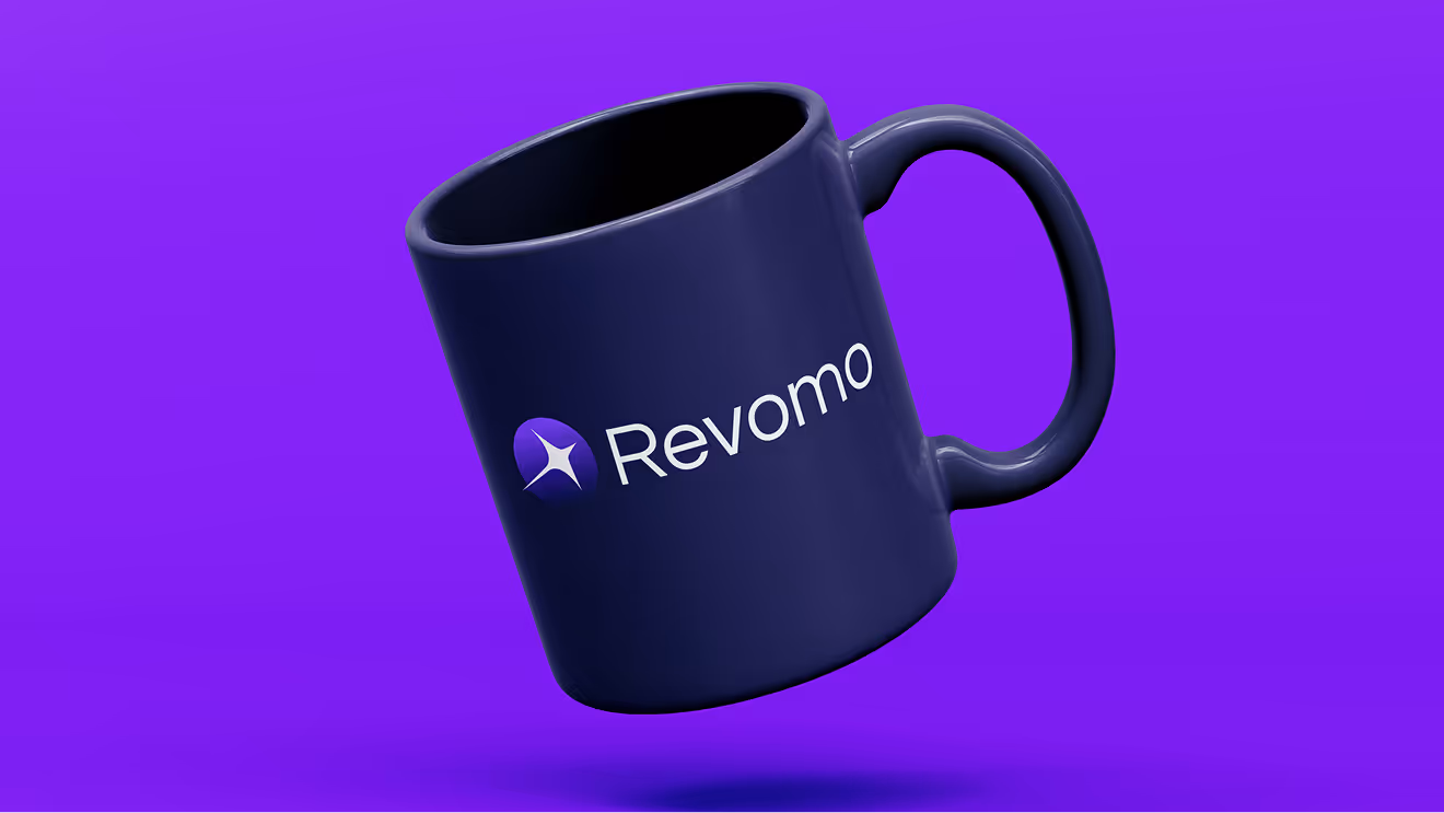
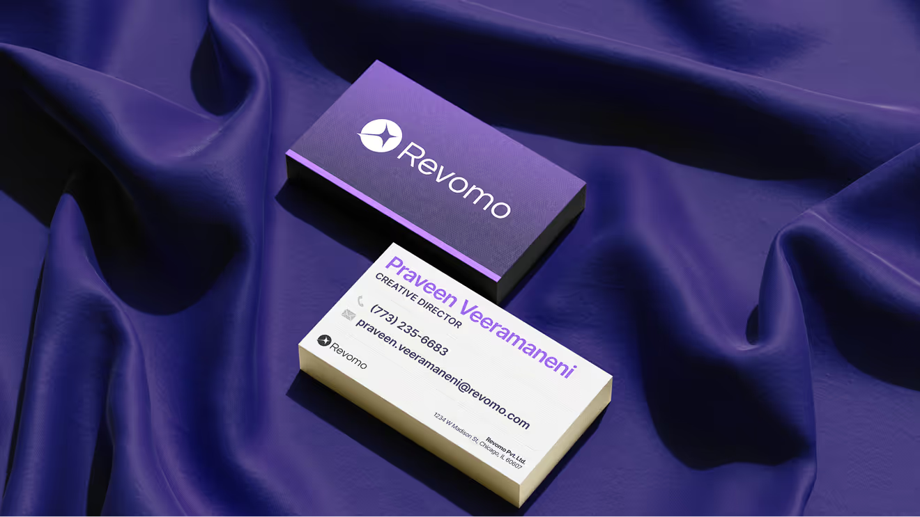
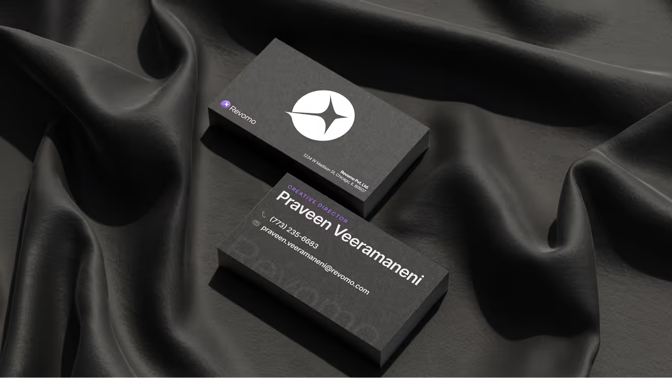
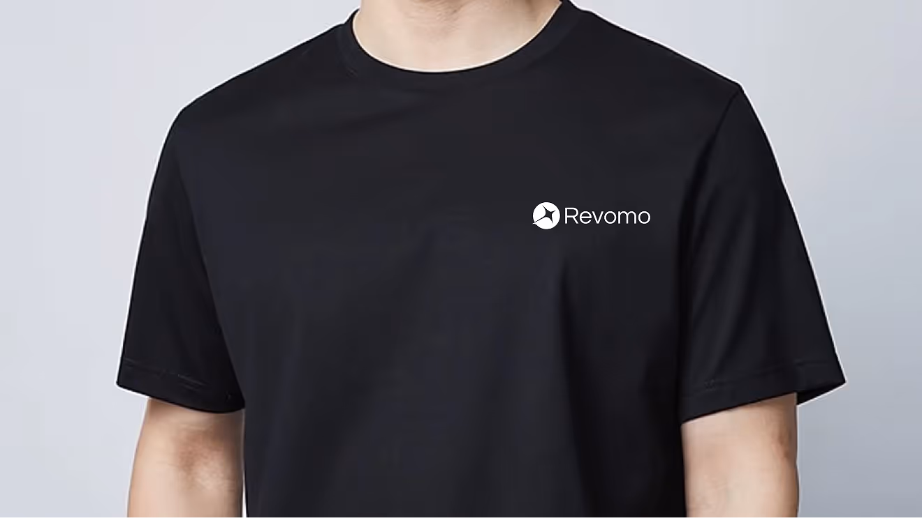
Logo in use
The Revomo logo consistently maintains its clarity, presence, and impact no matter where it’s used, whether on digital screens, printed materials, or merchandise. This consistent application ensures the brand always stands out clearly and professionally, helping you effortlessly visualize how to apply the logo in your own projects while preserving its strong identity.

What to avoid
Do not alter the logomark, logotype or lockups in any way. Always use the Revomo logo in its original state. These examples convey various violations of the rules:
- Don’t stretch, distort, or alter the logo’s proportions in any way.
- Don’t change the logo colors outside the approved palettes.
- Don’t place the logo on backgrounds with insufficient contrast or busy patterns.
- Don’t add shadows, outlines, or effects that alter the logo’s clarity.
- Don’t rotate, flip, or otherwise manipulate the logo orientation.
- Don’t crowd the logo; always maintain the required clear space around it.
- Don’t use low-resolution or pixelated versions of the logo.
- Don’t combine the logo with other graphic elements or text that compete with it.
Colors
Brand palette
A bold star with a trailing effect placed over a circular form, evoking the idea of AI intelligence dominating the digital landscape. The planetary reference subtly hints at global influence and scalability.
Extended palette
A bold star with a trailing effect placed over a circular form, evoking the idea of AI intelligence dominating the digital landscape. The planetary reference subtly hints at global influence and scalability.
Typography
Primary typeface
Inter Display is the primary font choice for all Revomo materials.
Inter Display


Regular
Medium
Semibold
Secondary typeface
Inter is the font choice for body and visual content.
Icons
These icons represent key elements used throughout the Revomo website, reflecting our brand’s visual language. You can download the complete set to ensure consistent and cohesive icon use across all your projects. This collection helps maintain a unified look and feel wherever Revomo’s brand appears.
Homepage


.svg)
.svg)
.svg)
.svg)
.svg)
.svg)
.svg)
Product Pages

.svg)
.svg)
.svg)
.svg)

.svg)
.svg)

.svg)
.svg)
.svg)
.svg)
.svg)
.svg)
.svg)
.svg)

.svg)
.svg)
.svg)
.svg)

.svg)
.svg)
.svg)
.svg)
.svg)
.svg)
.svg)

.svg)
.svg)
.svg)
.svg)
.svg)
.svg)
.svg)
.svg)
.svg)

.svg)
.svg)
.svg)
.svg)